Bitly
build strong connection
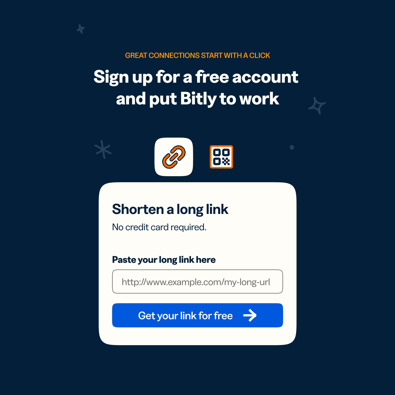
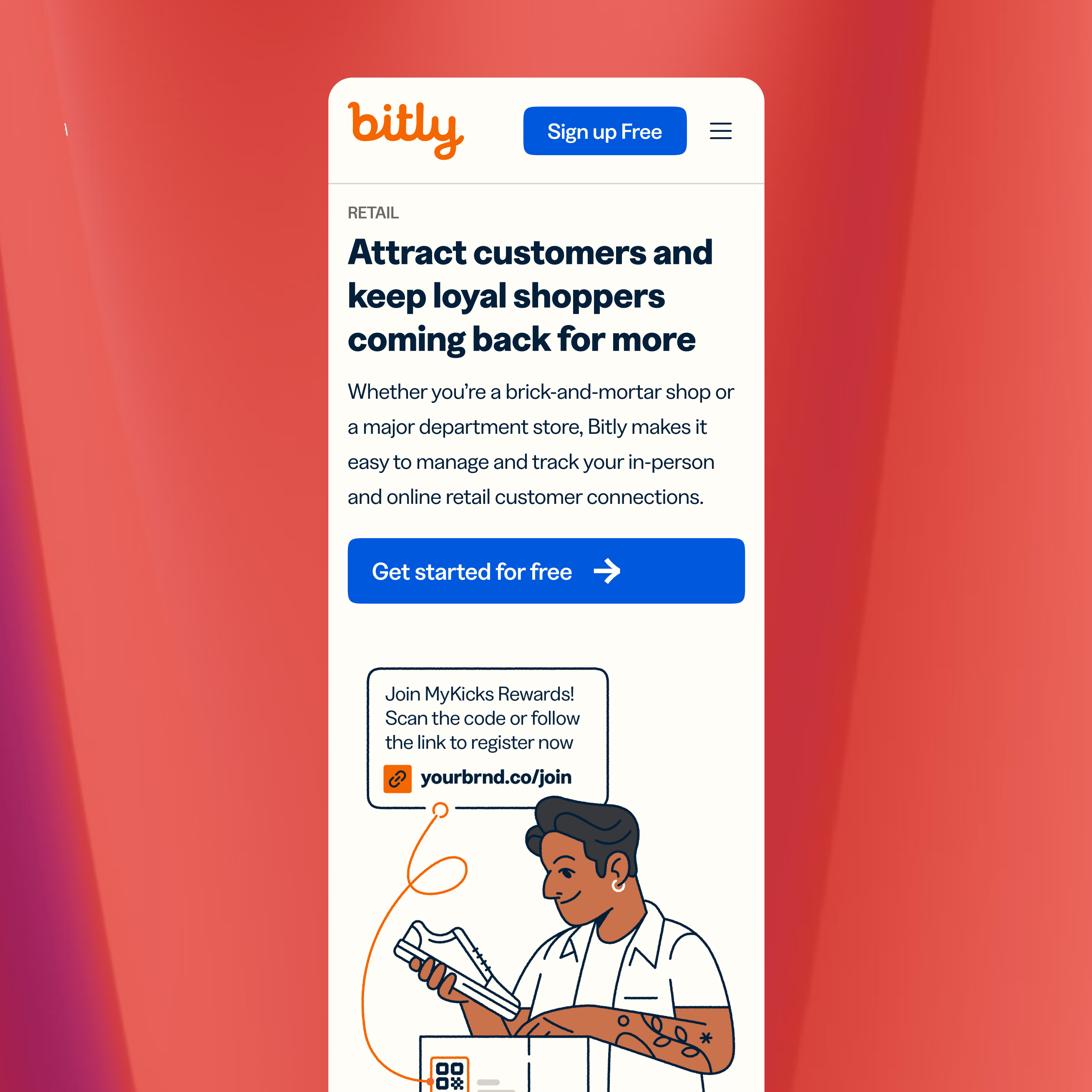
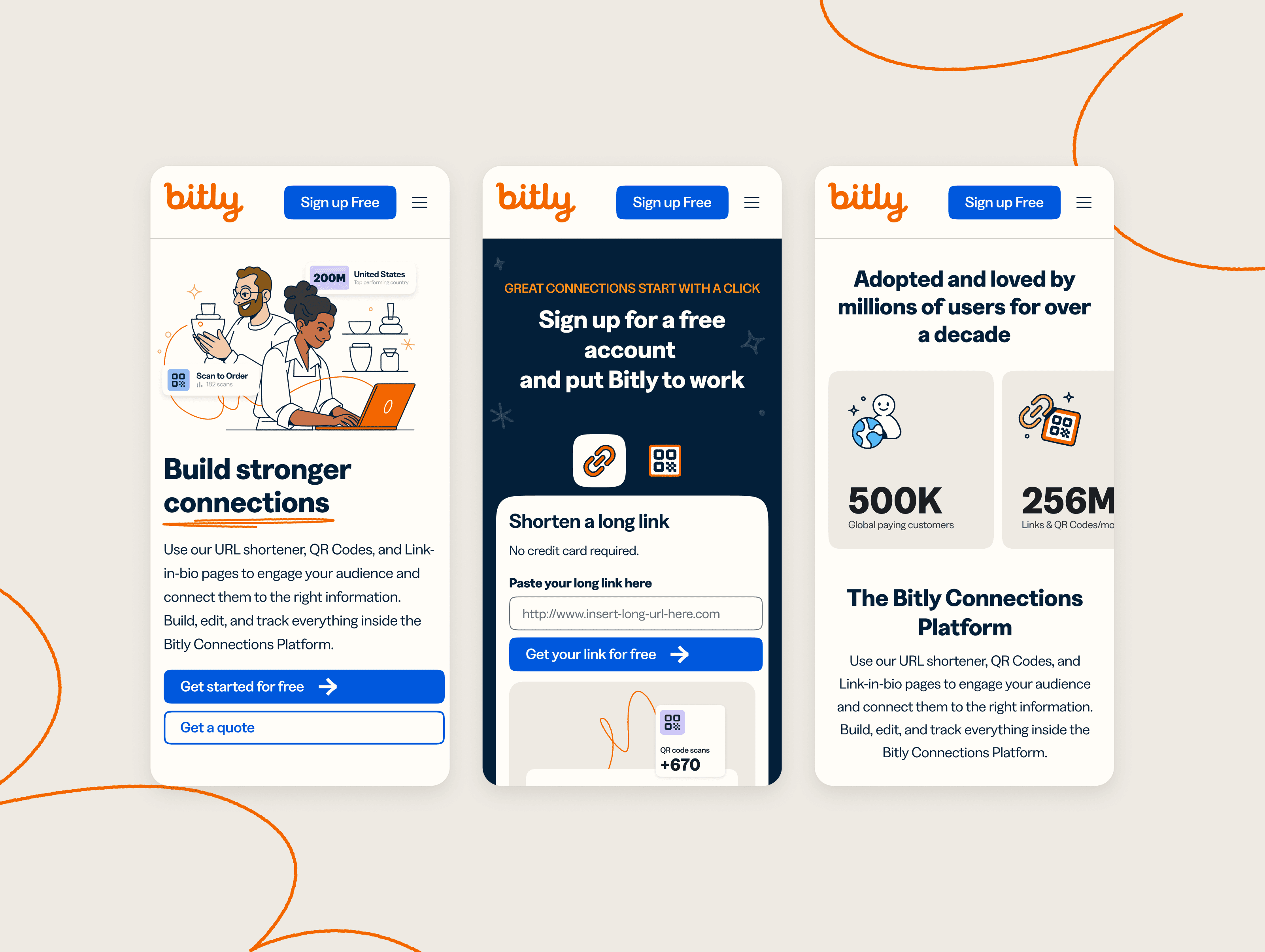
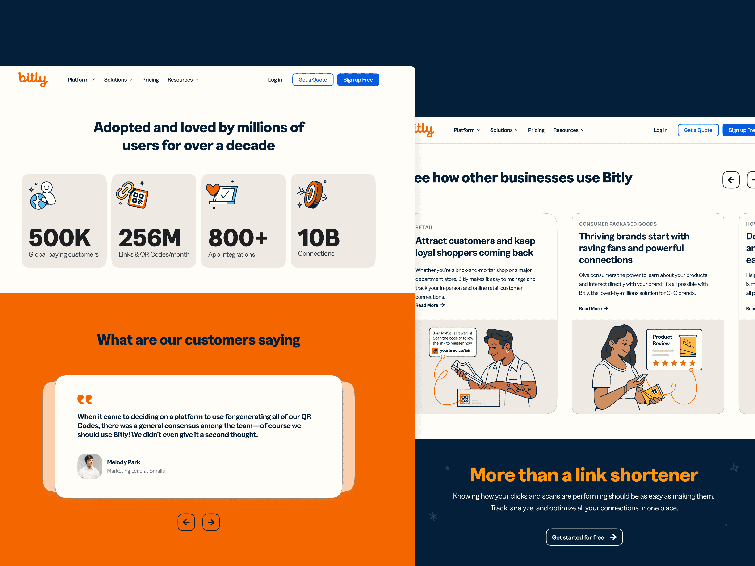
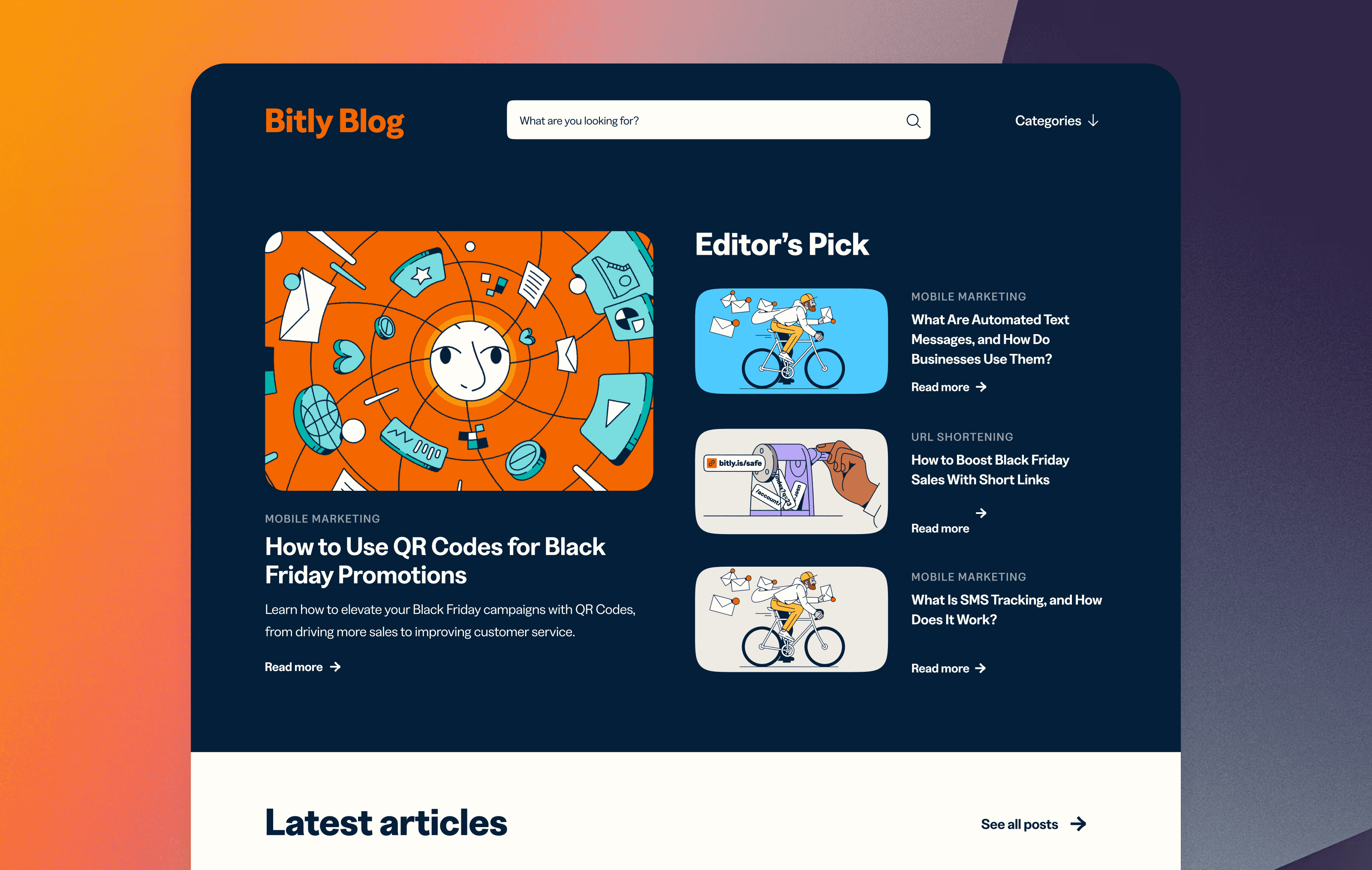
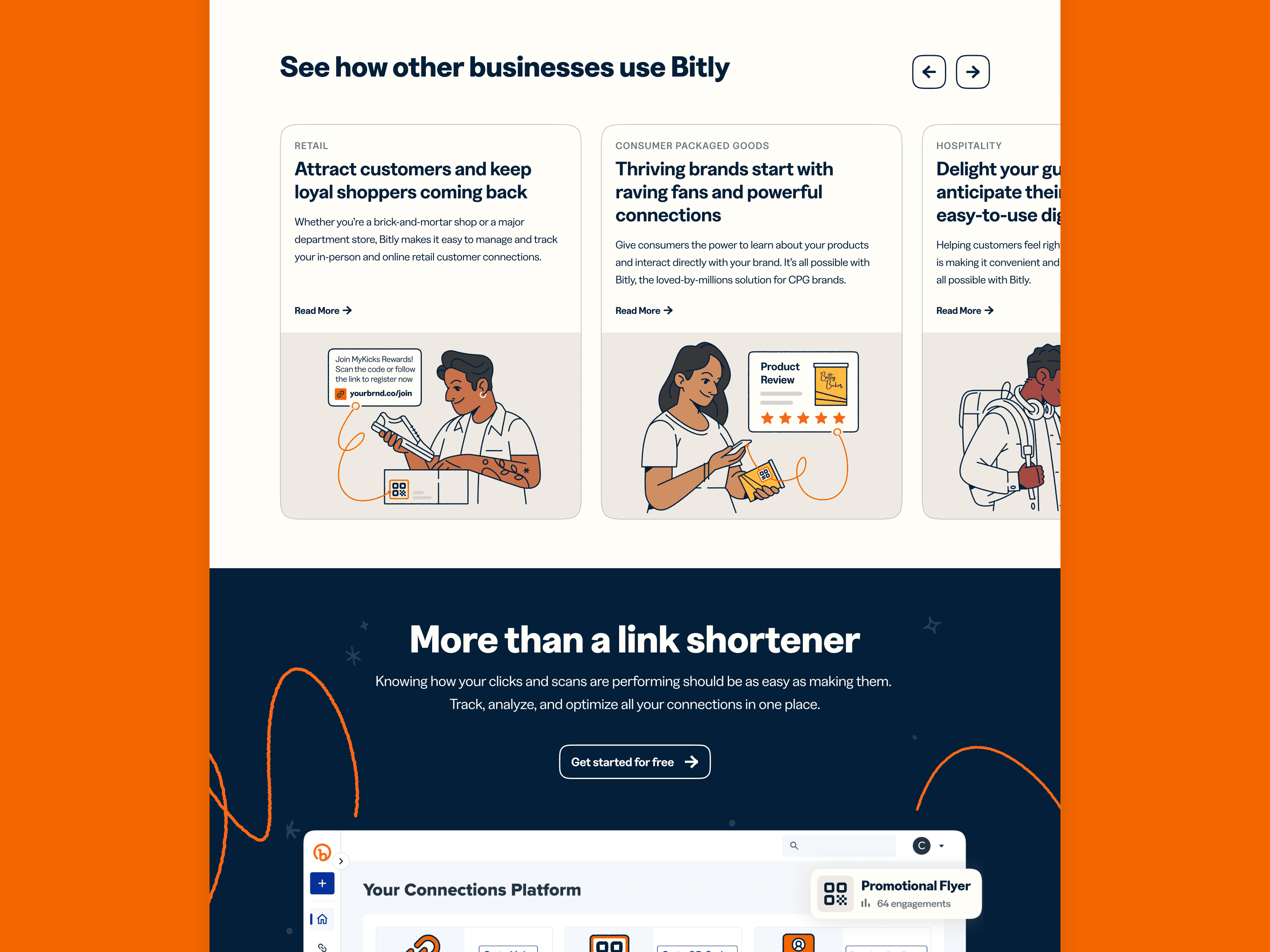
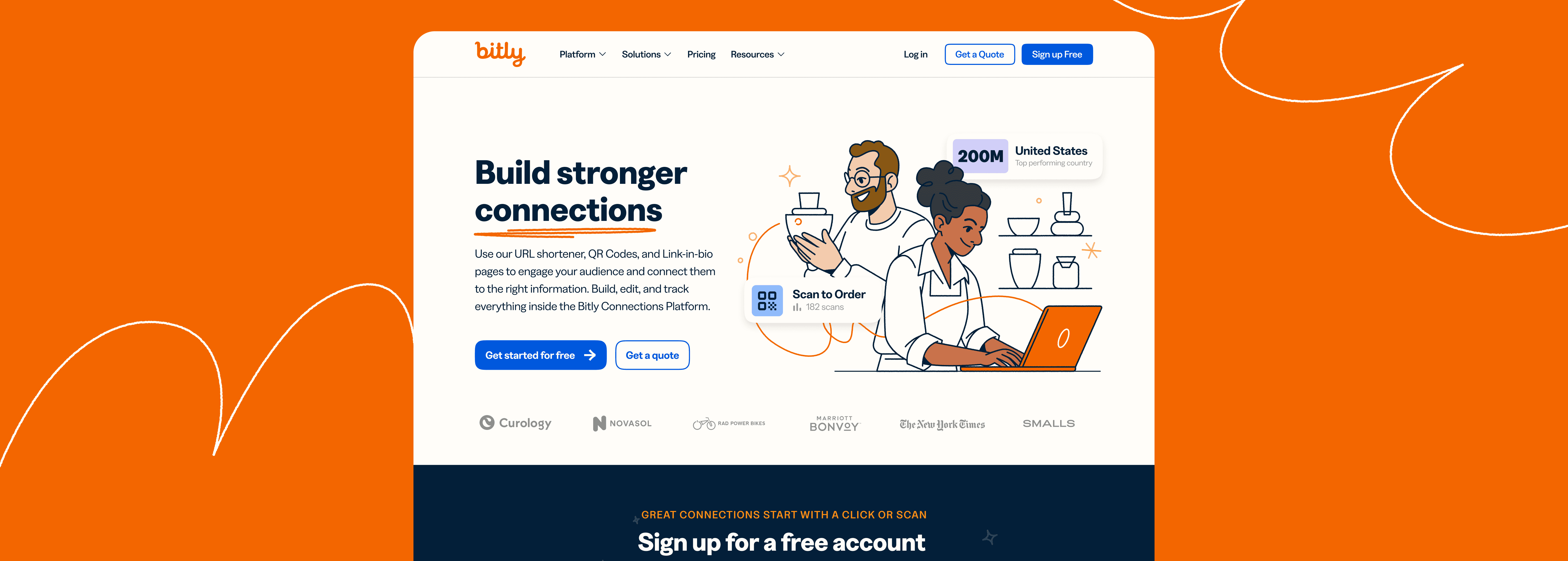
After conducting a full UX and UI audit of the previous Bitly website, I led a complete redesign of the entire experience - including a brand refresh focused on color and typography.
The goal was to make the interface bolder, fresher, and more intuitive, while simplifying how users interact with Bitly’s core products: the Link Shortener and QR Code Generator.
Design enhancements focused on:
- Introducing a clean, spacious layout with strong visual hierarchy
- Using vibrant blues and bold CTAs to drive conversion
- Refreshing typography for approachability and modernity
- Integrating dynamic lines and illustration elements to reinforce
- Bitly’s core theme of connection
- Improving mobile responsiveness and overall accessibility
The result is a modern, conversion-driven SaaS experience that positions Bitly as a category leader - while making its tools more usable, engaging, and visually cohesive for millions of global users.
FIELD
Tech & SaaS
SERVICES
UX/UI Design