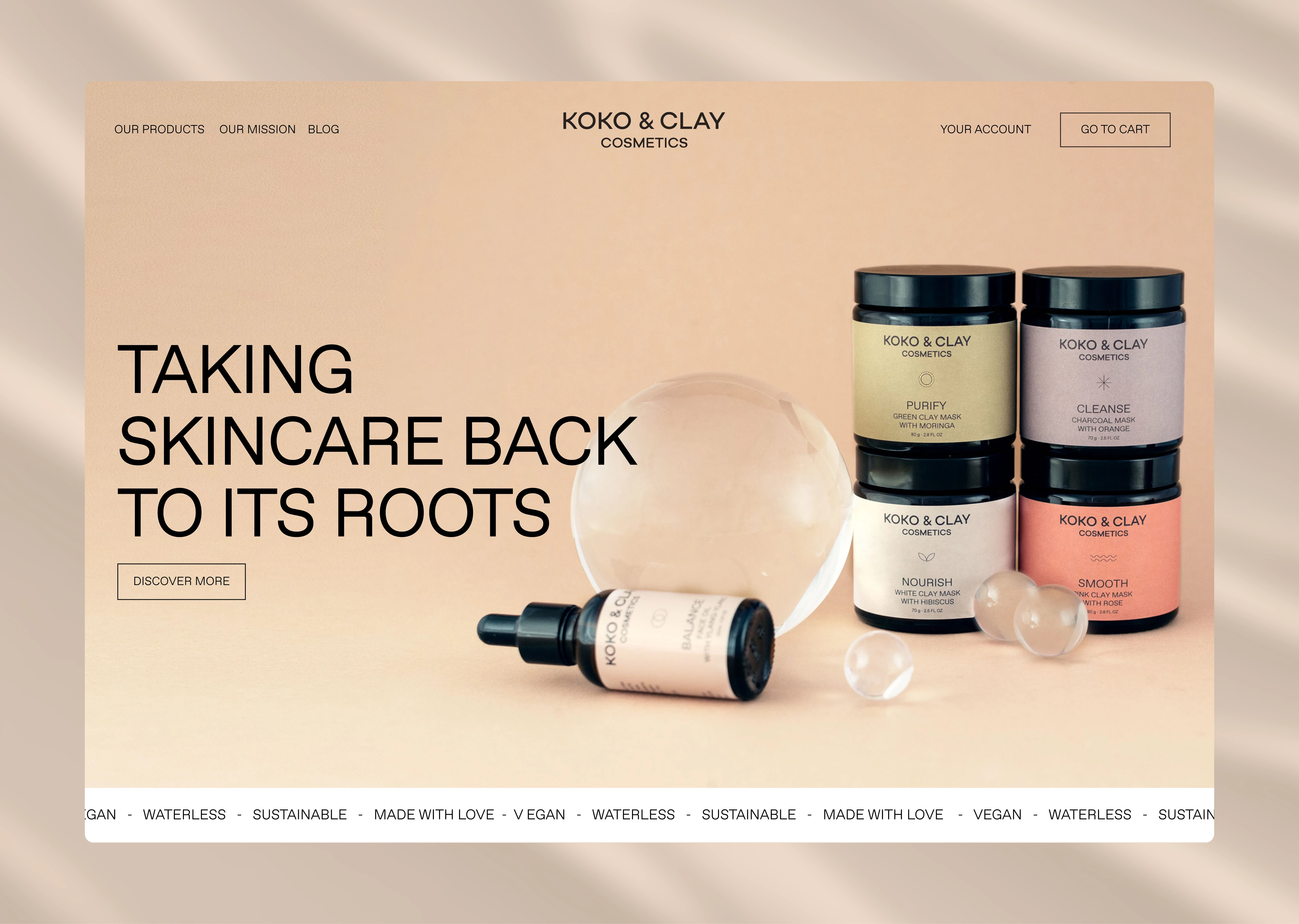
Koko&Clay
natural skincare
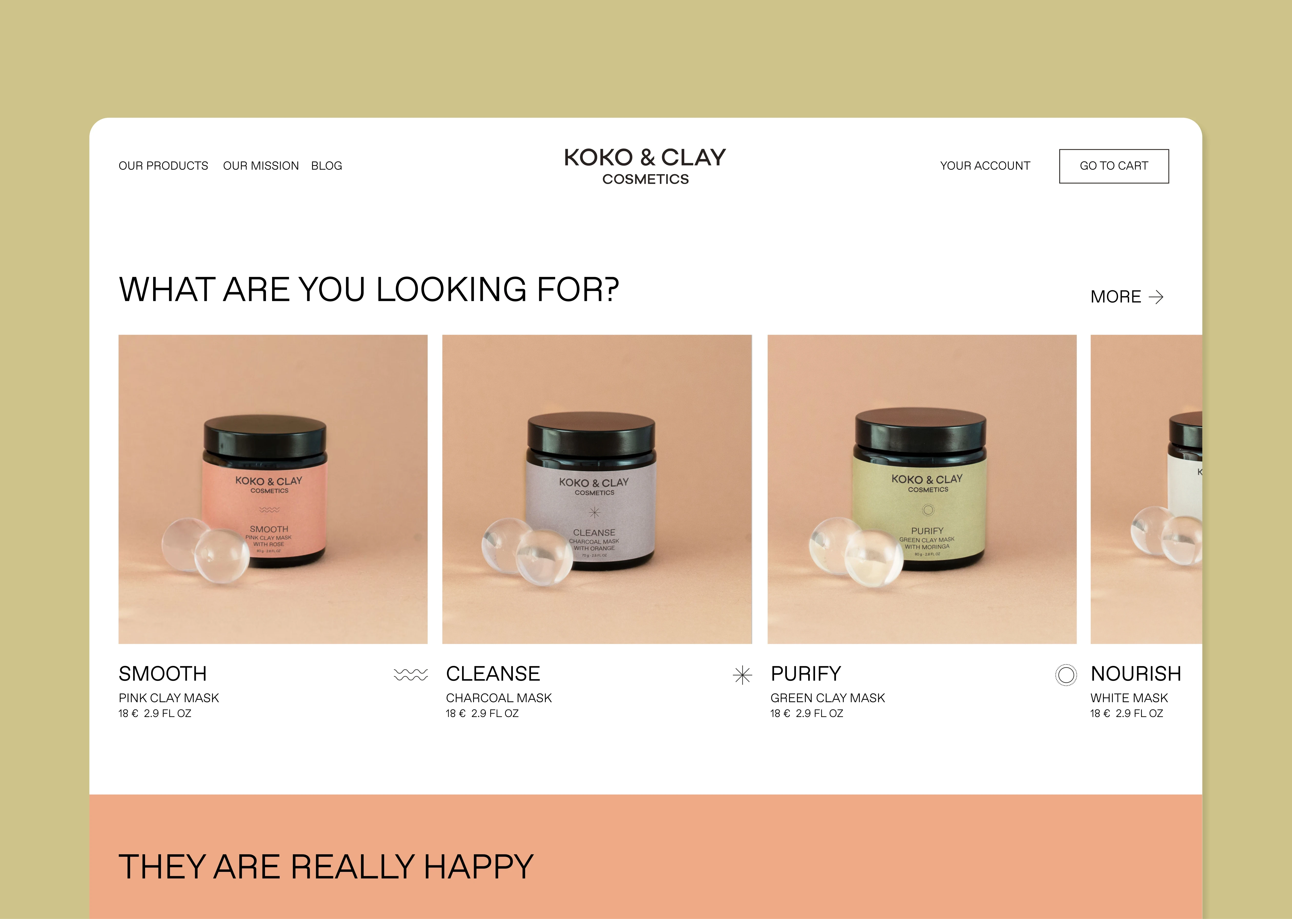
Koko&Clay is a German cosmetic brand centered around conscious, natural, and mindful beauty. Each product is crafted from unique formulas created by the founder, inspired by ancient beauty rituals and traditions from around the world. Made entirely with natural ingredients, the brand seeks to give power back to nature.
For the rebrand, the goal was to convey the simplicity and honesty at the heart of Koko&Clay, while emphasizing its natural essence. The logo reflects this through its typography — the letter “k” takes the shape of a plant, symbolizing growth and connection to nature.
Koko&Clay aims to bring skincare back to its roots, and the logo serves as a visual expression of that philosophy.
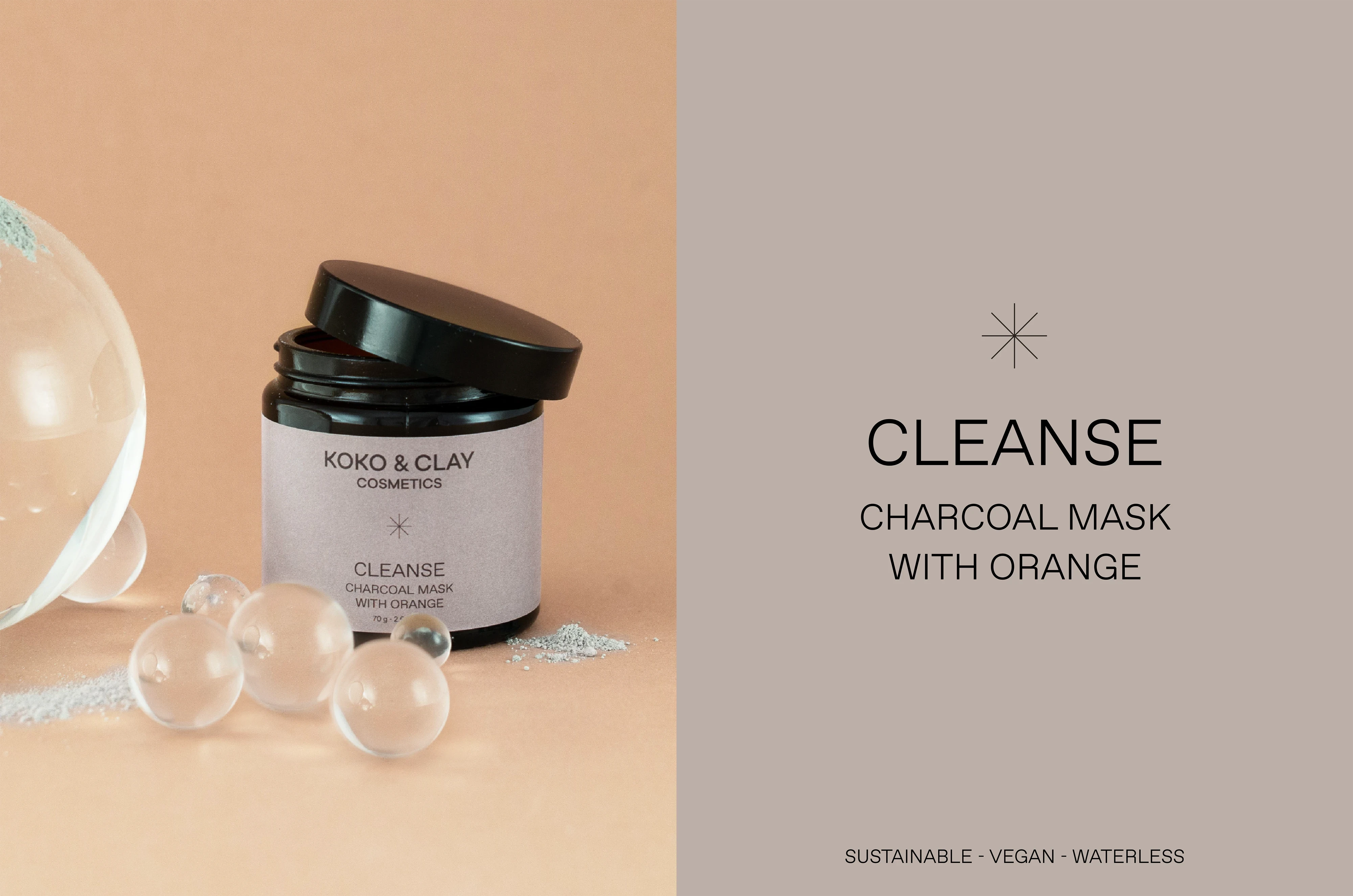
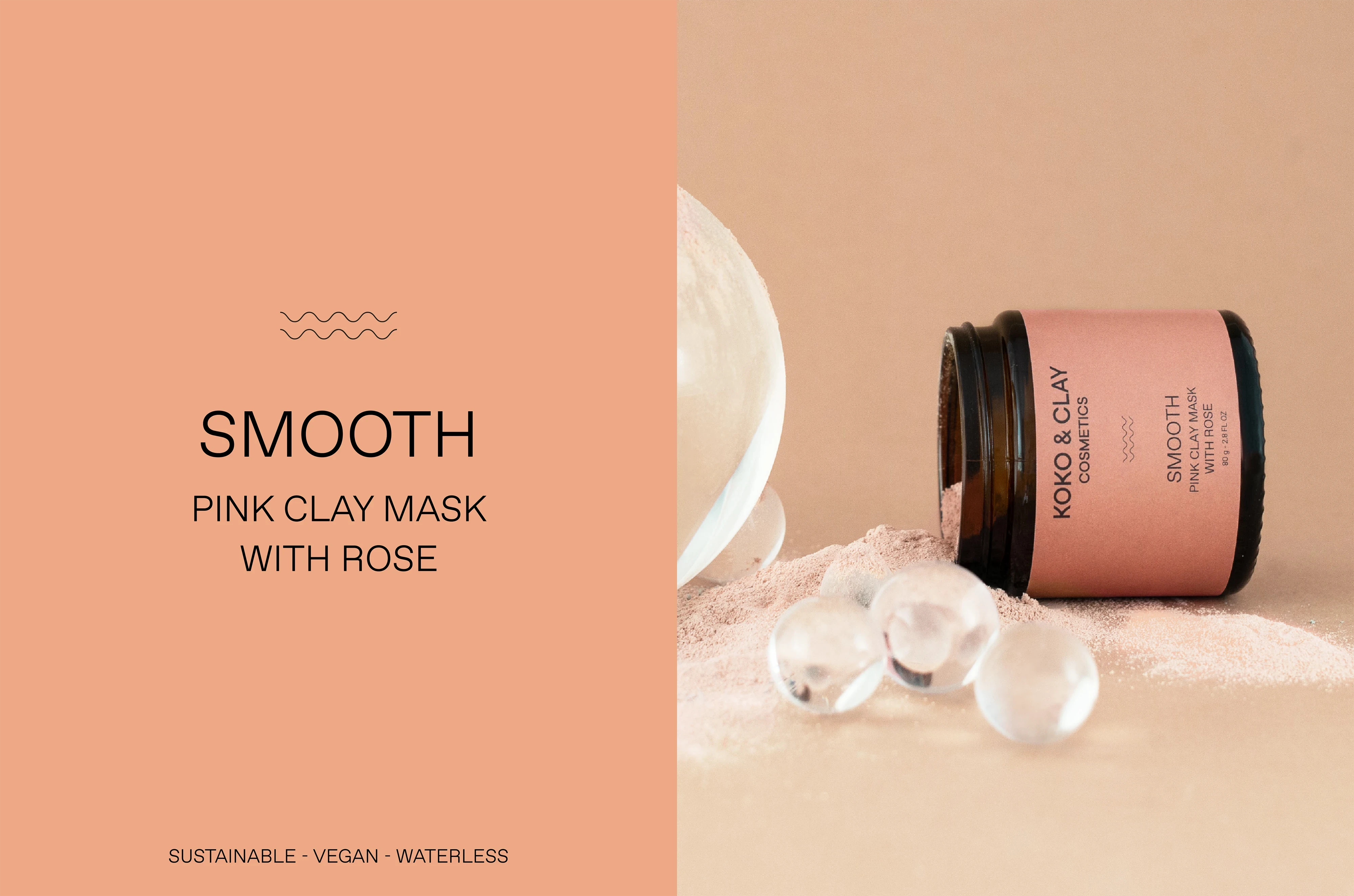
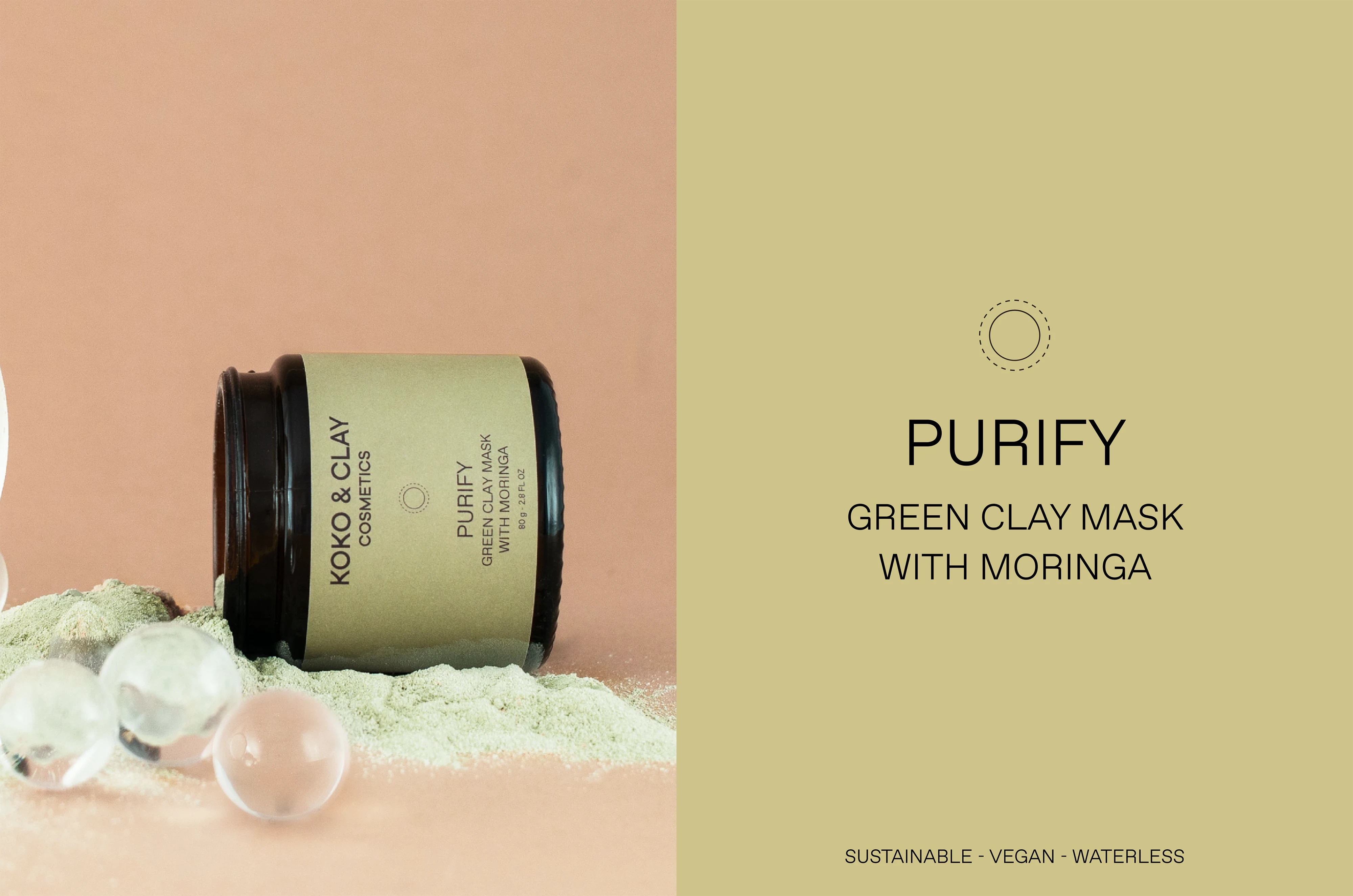
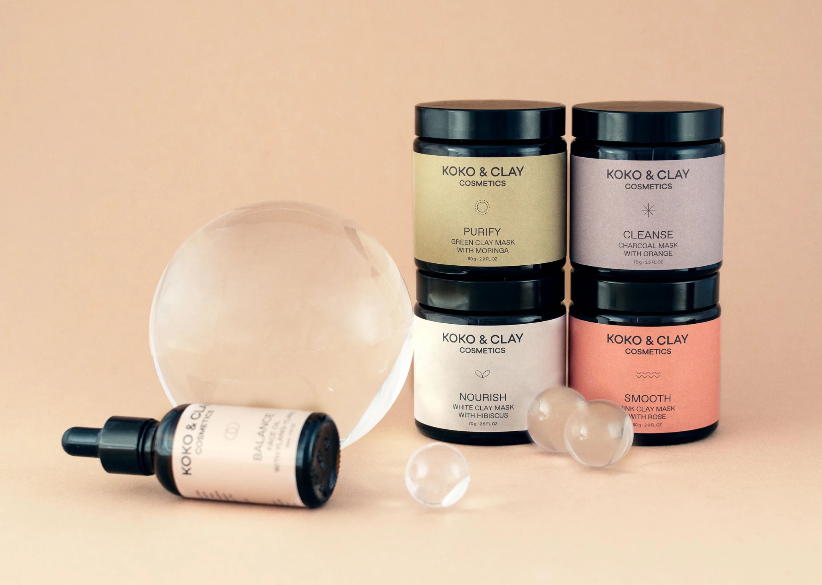
The packaging highlights both the specific benefits of each product and their natural ingredients. Each label’s color reflects its main ingredient, while the icons play a key role in illustrating the unique benefits of every formula.
FIELD
Skincare
SERVICES
Branding
Packaging
Website design
E-Commerce